Usability for Evil
How do some companies get their customers to do something that’s useful for the company but not really for the customer?
Topics
Chris Nodder is a director at the Fremont, California-based usability consultancy the Nielsen Norman Group and a contributor to The Politics of Usability: A Practical Guide to Designing Usable Systems in Industry (Springer Verlag, 1998). In his day job, he makes products and services easier to use and more productive, but he moonlights as the proprietor of the Evil by Design Web site (usability4evil.com), where he aims to “discover purposefully designed interfaces which make users emotionally involved in doing something that benefits you more than them.” Of course he isn’t really trying to take over the world via malevolent usability techniques (we think), but the examples he gives of evil usability do suggest ways companies might treat their customers better. Here are just two examples.
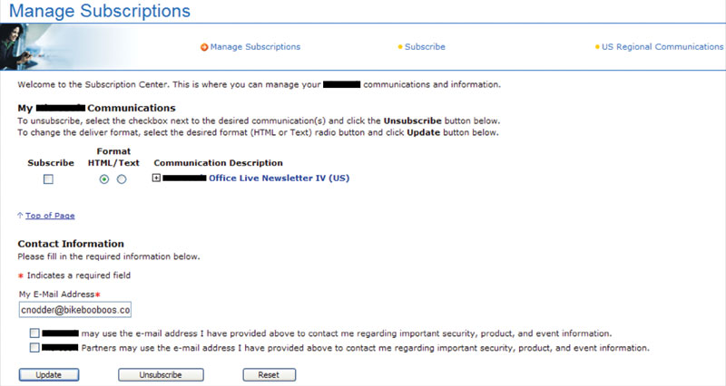
Sometimes an interface appears to be designed solely to fool someone. Chris wants to unsubscribe here, but in order to do so, he has to check the box labeled “Subscribe.” Would a company that really wants to make it easy for customers to do what they want design an interface like this? Perhaps this is a way to prevent people from unsubscribing.
Here, the designer has decided to take up a whole step in asking for information that doesn’t help the user at all. And, optional or not, how frequently will anyone fill this out? Few customers are likely to know their rep’s employee number or be willing to stop the process in order to find it. If you need to solicit information, make it clear why providing that information is worth an individual’s time.
Evil By Design
Sometimes an interface appears to be designed solely to fool someone. Chris wants to unsubscribe here, but in order to do so, he has to check the box labeled “Subscribe.” Would a company that really wants to make it easy for customers to do what they want design an interface like this? Perhaps this is a way to prevent people from unsubscribing.
Here, the designer has decided to take up a whole step in asking for information that doesn’t help the user at all. And, optional or not, how frequently will anyone fill this out? Few customers are likely to know their rep’s employee number or be willing to stop the process in order to find it.
Comments (2)
kk
Jill Borestad