The Simple Power of the Slow Reveal

Topics
Column

Carolyn Geason-Beissel/MIT SMR | Getty Images
Organizational data is human data. It measures customers who discern and buy, employees who create and implement, team members who collaborate and troubleshoot, managers who engage and motivate, and rivals who innovate and compete.
When business data is generated by tracking the activity of human beings, the numbers deserve to be communicated in a way that highlights the human story behind them.
I’ve written about how to make data insights visually consumable and how to choose charts that everyone can understand. Over my many years of helping business leaders develop their data communication skills, I’ve also found that using a narrative approach — storytelling — can get people to pay attention to numbers in a new way. Here, I want to share how adding a temporal element can generate a visceral reaction in an audience.
Get Updates on Innovative Strategy
The latest insights on strategy and execution in the workplace, delivered to your inbox once a month.
Please enter a valid email address
Thank you for signing up
Leaders can encourage an emotional reaction to data by using the classic storytelling tool of building suspense. Instead of using a single slide that shows every bit of data all at once, a presenter can make numbers thrilling by revealing data piece by piece.
All stories have an emotional arc, and it’s really no different with data. By taking three steps — identifying the story arc that your data follows, creating “builds” in your visuals, and recognizing heroes and battle lines — you can bring storytelling and humanity to your data presentation.
Identify the Story Arc Your Data Follows
In storytelling, a narrative arc in which the tension rises and falls is what takes an audience on a journey: from a familiar state, through various ups and downs, to a final or end state.
In 2016, when a group of academic data scientists conducted a digital analysis of 1,327 works of fiction, they discovered that stories follow six basic emotional arcs, with three leading to a better future and three leading to tragedy. The works were plotted using a framework first proposed in the 1960s by writer Kurt Vonnegut, who noted that stories move up a vertical axis when the hero is having good fortune and down the axis when they are experiencing ill fortune, as the plot undulates over time. This is the simple framework of the x- and y-axes of Vonnegut’s model:
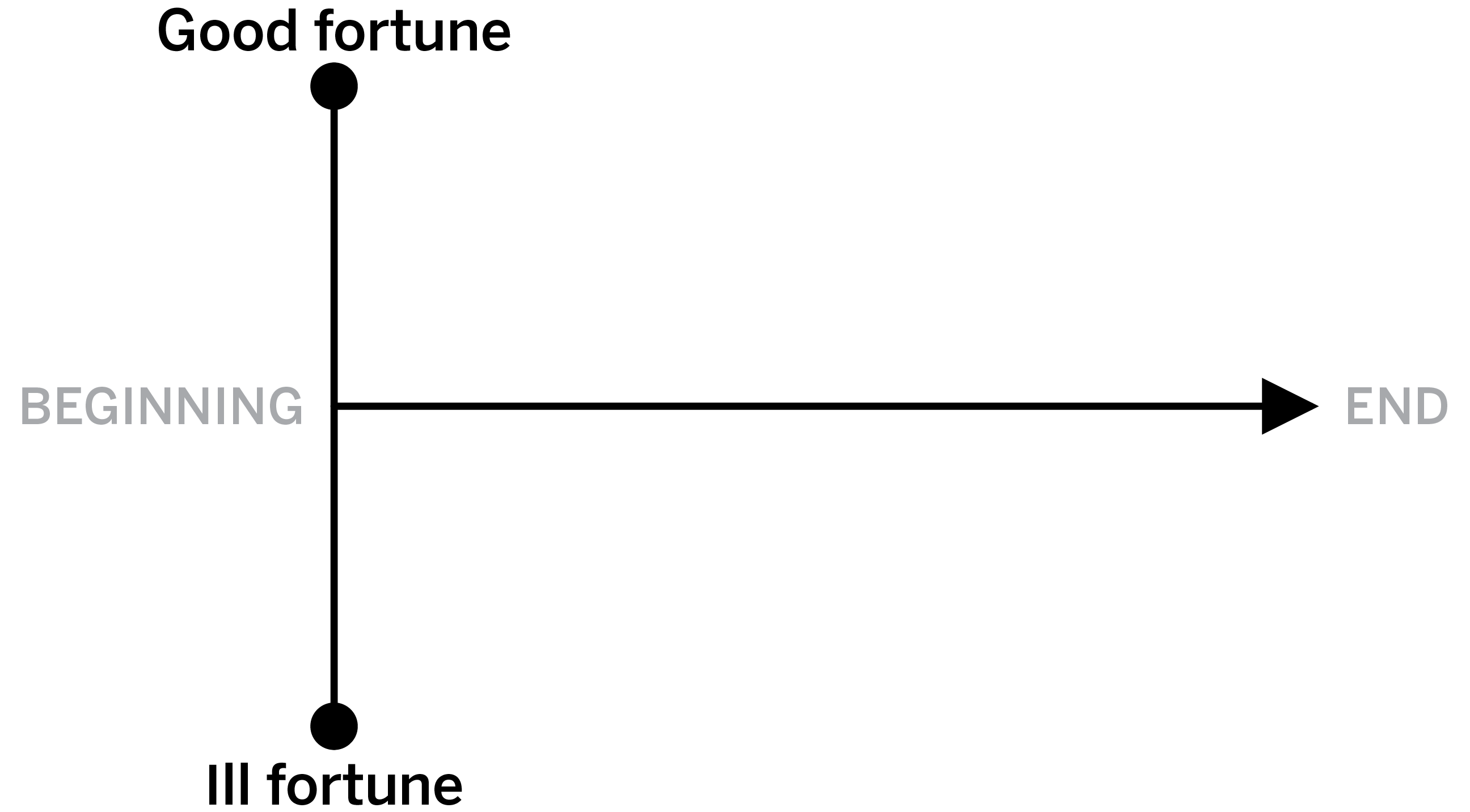
The three arcs that end in good fortune are the rags-to-riches story (where the protagonist goes from a harsh condition to a good one), the man-in-a-hole story (where the protagonist starts in a good place, then stumbles, then gets up again and succeeds), and the Cinderella story (where the protagonist goes through many waves of rising and falling fortune before finally ending on a rise — the classic arc that Western cultures love). The three classic arcs toward ill fortune are the inverse of those: riches to rags, Icarus, and Oedipus, respectively.
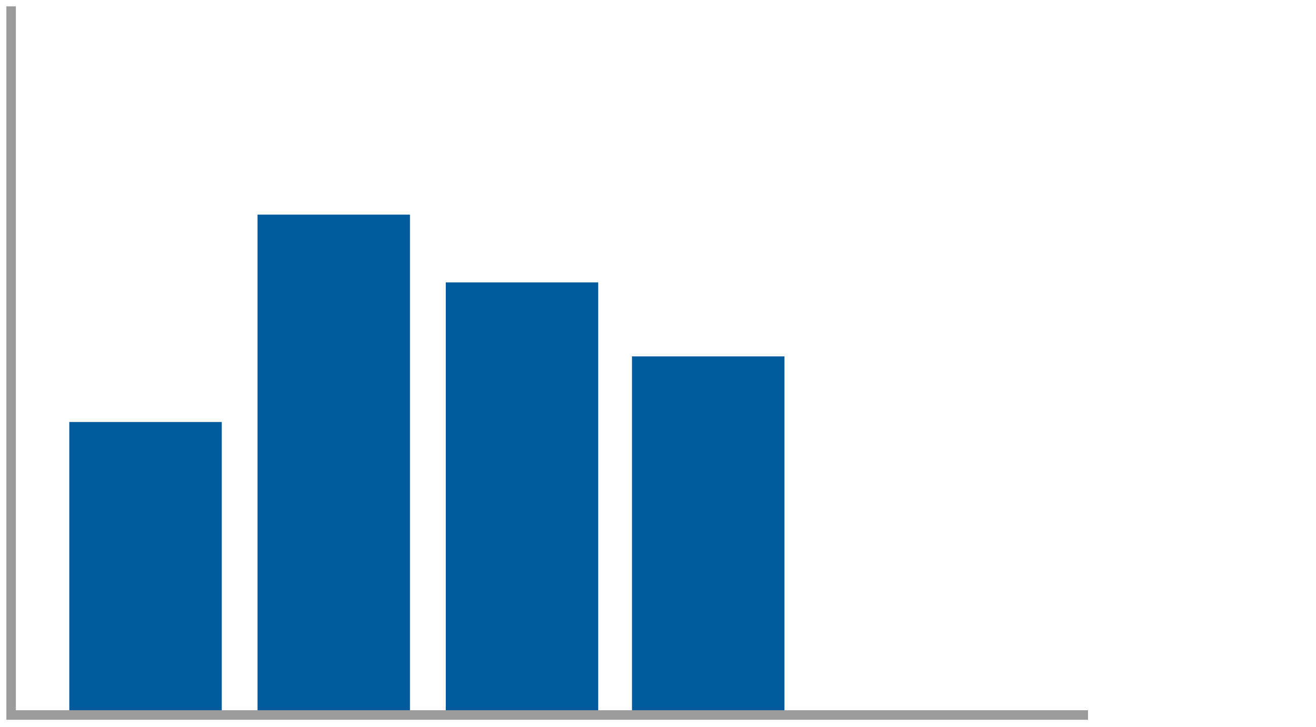
Plotted data follows these same arcs, but in a visual way. Most classic business charts that have a positive outcome have the final plotted number up high and to the right. The journey to get there can be a straight line or involve any number of dips and rises. (See “Three Ways to Chart Your ‘Happily Ever After.’”)
If your data reveals a positive outcome for KPIs, objectives and key results, or other dashboard metrics, determine which of the positive arc patterns it follows — rags to riches (where the numbers steadily rise), man in a hole (where they fall, then rise), or Cinderella (where they rise, then fall, then rise again). When data follows one of these three shapes, you have an opportunity to lead the audience to a strong visceral response.
Create ‘Builds’ in Your Visuals
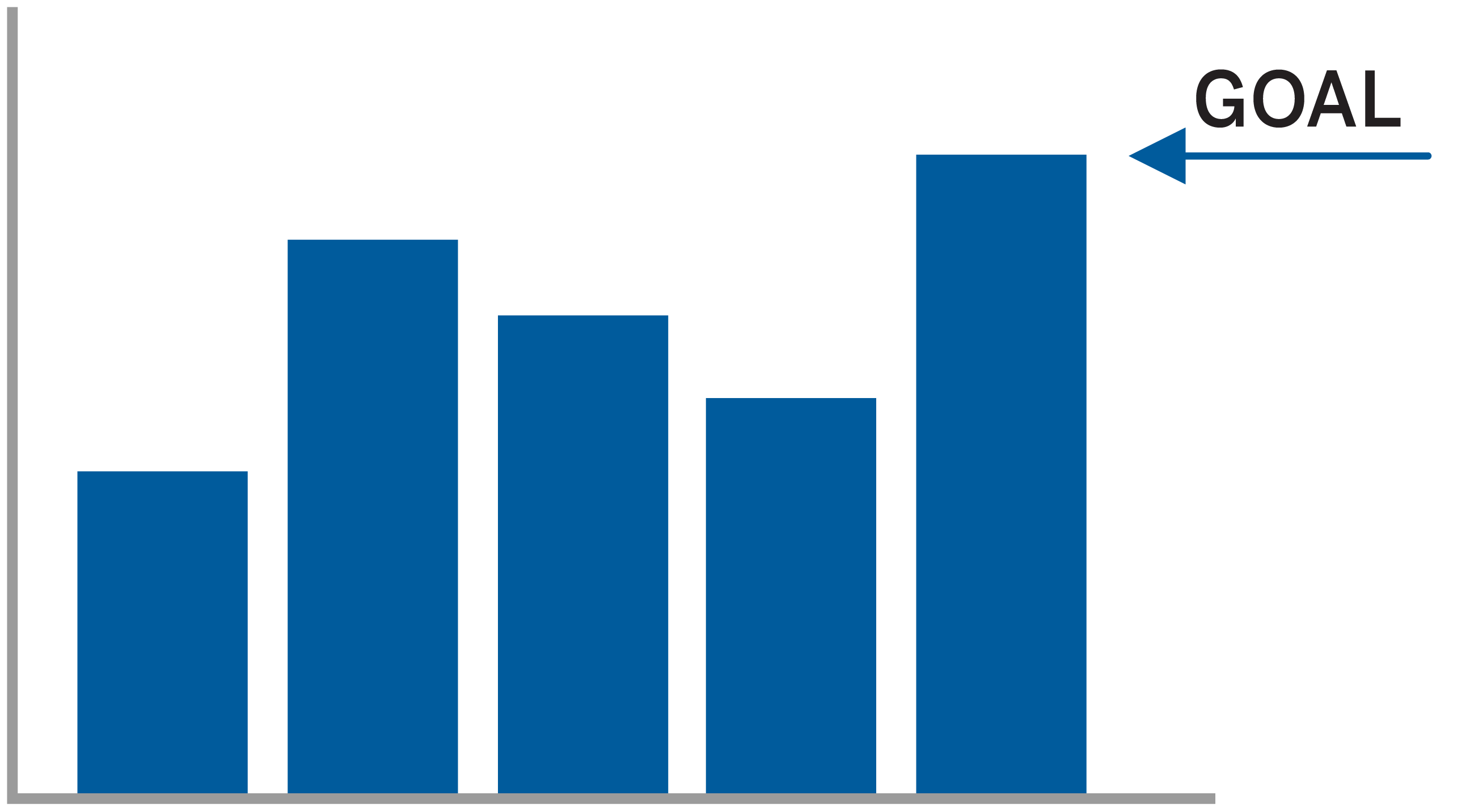
When you’re sharing your insights in a presentation, you’ll want to display your chart one or two bars at a time. This approach will give you control over when people receive each wave of information. You’ll have time to fill in the details as you speak, generating suspense within the data narrative.
You might start with describing a trend’s historical performance by recapping how the data looked in the past — for instance, how a team performed in the first and second fiscal quarters:

You present the first and second bars with narrative to support how things were great as that data was rising. But now you reveal that the third and fourth quarters trended downward:
With this chart, you explain why the numbers dipped. Before you show the next bar, you remind everyone that the team members made a commitment to rally to turn things around and were energized to set an aggressive goal, knowing that it was going to take a lot from each of them. You can incorporate some dramatic pauses as you reveal the next bar; for instance, you might say, “This was our goal. It was an ambitious goal, an aggressive KPI.”

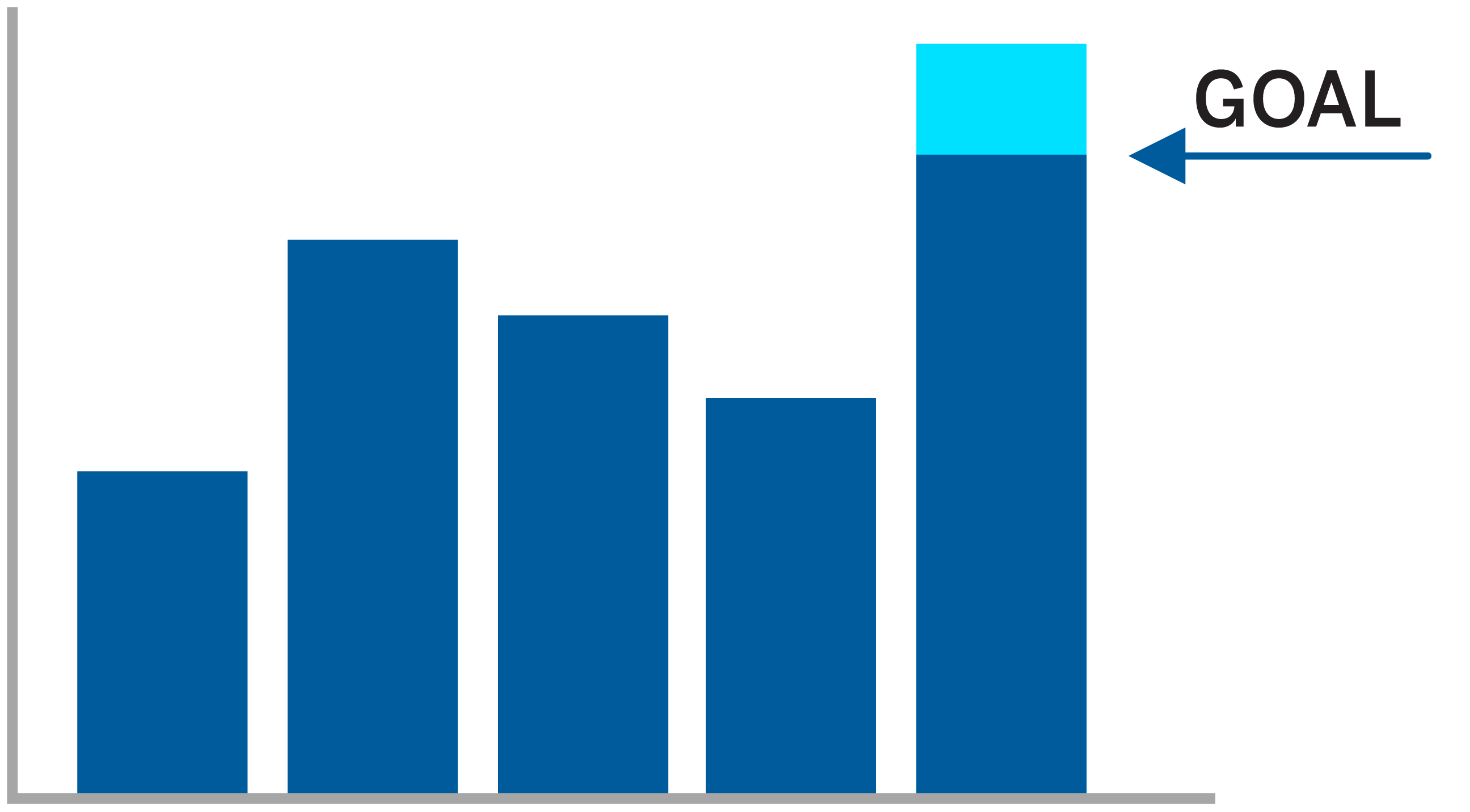
Then you show the next bar and say, “And guess what: We hit that goal!”
At this point, the audience typically is excited. Maybe you hear applause and some cheering.
But maybe you’re holding back a little information about extra good news. This is when you share it — at the end (not at the very beginning, before you’ve taken people on this journey).
You pause, and then you say, “But … that was an early cut at the numbers. We actually blew past that target.” And you show the next slide.
Present the information this way, and people may start a little whooping and hollering.
You get the picture. Your visuals reveal your narrative, one bit of data at a time. Revealing data piece by piece instead of all at once not only helps your presentation make sense but also creates meaning.
Recognize Heroes and Battle Lines
One more tool to incorporate into presenting data is the idea of a hero. There’s nothing like a battle of good versus evil to elicit a passionate response to a data-driven idea.
In the example above, the people in the audience are the hero of the data story. They rallied, and their actions turned the trajectory of the data around.
Using language that identifies people as heroes is a way to help them see their role in creating a positive outcome. They stood in the hero’s shoes, facing the adversary. Once your audience is connecting on that level, invite them to consider what will sustain the hero’s desire to reach their goal and give them the energy to fight the good fight.
Deploying data visualization tools in a thoughtful way can make all the difference in moving audiences that are distracted by busy jobs and competing demands. The goal is to get an audience actively invested in what the data is revealing.
Inspiring people to move in a desired direction can be a struggle — especially if you’re asking them to change their behaviors to help the organization see a change in its numbers. Defining the struggle and conflicts your hero endured is storytelling at its finest. Charting the hills and valleys of the hero’s journey, and building the reveal, elicits a gut response. By clearly defining your cast of characters and placing your audience in the hero role, you can highlight the human desires, struggles, and accomplishments within your data and get people to engage more deeply with your ideas.